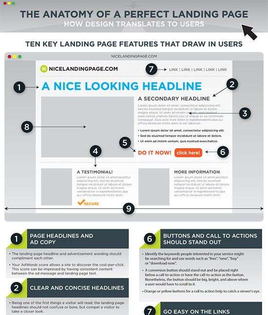
The perfect landing page is a key component of any lead generation strategy. But what makes a landing page perfect? Keep on reading and learn from some the best practices we implement here at UPPERFORM.
There are a few key elements that all successful landing pages share.
First and foremost, a landing page must be designed with conversion in mind. We want potential customers to give key information to us: name; email and phone number. Every element on the page should be geared towards getting the visitor to take this action.
It should also be short and to the point. Visitors should be able to understand what you’re offering and why they should care, without having to wade through paragraphs of text. Sounds counter intuitive, but the less scrolling there is on the landing page, the better job was made keeping the key message and value proposal short.
Additionally, a landing page should be optimized for search engine ranking, do take a look at our article with advanced SEO concepts here . This means including relevant keywords and making sure the page loads quickly and smoothly.
Finally, a perfect landing page must be tested and analyzed constantly. Try different headlines, images, and call to actions to see what works best for your audience. landing pages are never “finished”, but are always a work in progress. Another useful strategy to understand what works and what doesn’t for your customers is A/B testing. With this methodology you can quickly test different copy, image and capture form strategies.
By following these guidelines, you can be sure that your landing page is optimized for lead generation. So what are you waiting for? Get landing! At UPPERFORM we’re experts on building landing pages with high conversion rates. Contact us here and let’s discuss your project.
Landing pages are one of the most important elements of a lead generation strategy. A landing page is a standalone web page, distinct from your main website, that is designed with one purpose in mind: to convert visitors into leads.
The best landing pages are focused on a single call to action (CTA). Everything else on the page should be secondary and should support the CTA. The headline, images, and copy should all be pitched towards convincing the visitor to take the desired action: give us their contact information.
Landing pages should be short and to the point. Visitors should be able to understand what you want them to do within seconds of landing on the page. This means using clear, concise language and avoiding jargon. Use bullet points where possible to break up the text and make it easier to scan.
The design of your landing page should be simple and uncluttered. The CTA should be prominently displayed, and there should be no distractions that could pull visitors away from taking the desired action. Here you can see a very good example of the elements a Landing Page should have:

Including a form on your landing page is one of the most effective ways to generate leads. The form should be short, with only the essential fields required to capture the lead’s information. Asking for too much information will decrease conversion rates, as potential customers will simply not bother filling out the form.
Finally, consider using A/B testing to experimentation with different landing page elements to see what works best for your business. Try changing things like the headline, call-to-action, or even the form fields to see what leads to the most conversions. landing pages are all about experimentation, so don’t be afraid to try something new!
